Franchise News
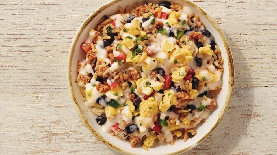
Nation's Restaurant News: A new look for Moe’s Southwest Grill
The modernized logo is the first step in the brand's path to a sleeker restaurant design.
Franchise News
The modernized logo is the first step in the brand's path to a sleeker restaurant design.
Moe’s Southwest Grill has debuted a sleeker, more modern logo design. According to a recent article in Nation's Restaurant News, this new look will feature a simplified design with a new color palette including turquoise and orange. The brand will do away with the chili pepper icon and vibrant red tone that has been central to the logo since 2000.
The new logo is just the beginning of a series of updates for the brand's aesthetic. Moe's plans to gradually elevate the appearance of its restaurants across the board to incorporate the modern appearance.
“Moe’s Southwest Grill is testing a new store design, and the logo is one component of that," said Lindsay Haynes, public relations manager.
Read the full article here
Photo Courtesy of the Moe's Southwest Grill Facebook
Sign up for the 1851 Franchise newsletter to get our biggest stories before everyone else
By signing up, you agree to our user agreement (including class action waiver and arbitration provisions), and acknowledge our privacy policy.