Franchise News
Pizza Hut Leans on Nostalgia by Bringing Back Retro Logo
The ‘60s and ‘70s-era logo indicates a shift in the chain’s marketing strategy.
Franchise News
The ‘60s and ‘70s-era logo indicates a shift in the chain’s marketing strategy.
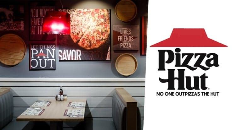
Pizza Hut is throwing it back to the “OG” days. Nation’s Restaurant News reports that the pizza chain is bringing back its cleaner, less-modern ‘60s and ‘70s-era red roof logo, which will launch in a national TV campaign for the limited-time return of its popular Cheesy Bites Pizza next week.
“It’s about celebrating where we came from,” Marianne Radley, Pizza Hut chief brand officer, told Nation’s Restaurant News. “We have to be a little braver, a little bolder in our choices.”
The rebrand and marketing reshuffling occurs after some “lackluster” performance numbers, notes the publication. “During market research sessions with consumers, guests responded enthusiastically when discussions turned to legacy brand features such as the red-roof restaurants and the red-and-white-checkered tablecloths,” NRN writes.
Read the full article here.
Sign up for the 1851 Franchise newsletter to get our biggest stories before everyone else
By signing up, you agree to our user agreement (including class action waiver and arbitration provisions), and acknowledge our privacy policy.

About the Author
Emily Clouse is a staff writer for 1851 Franchise. Her work has been featured with publications such as The Onion, Reductress, and Chicago Magazine. She graduated from The Ohio State University before running away to join the Peace Corps. In her free time, she enjoys drawing and walking to Jewel-Osco.